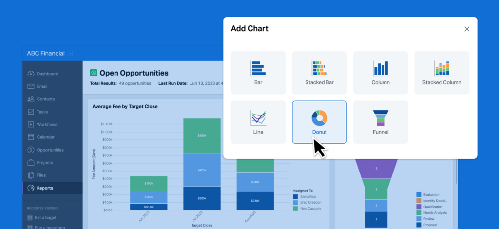
Seeing is believing. We’ve made several enhancements to the Reports functionality in Wealthbox over the last few months, but this may be the biggest enhancement yet: Charts and graphs are now available in Wealthbox reports, including bar, column, line, funnel, and donut charts! These visualizations will help firms get even more value from their CRM data, by enabling users to present information in familiar, easy-to-digest formats.
How it works…
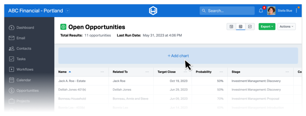
To add a chart to a report, just select “Add Chart” from the Actions menu of any report. The chart will appear at the top of the report page.
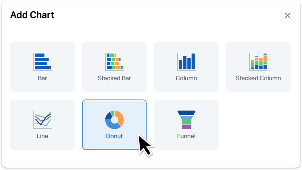
Reports in Wealthbox can now include bar, column, line, funnel, and/or donut charts. Categories will be shown on the x-axis, and can be chosen for a chart based on the groups applied to a report. For bar and column charts, you can add a second category, and the chart will become a stacked bar or column chart.
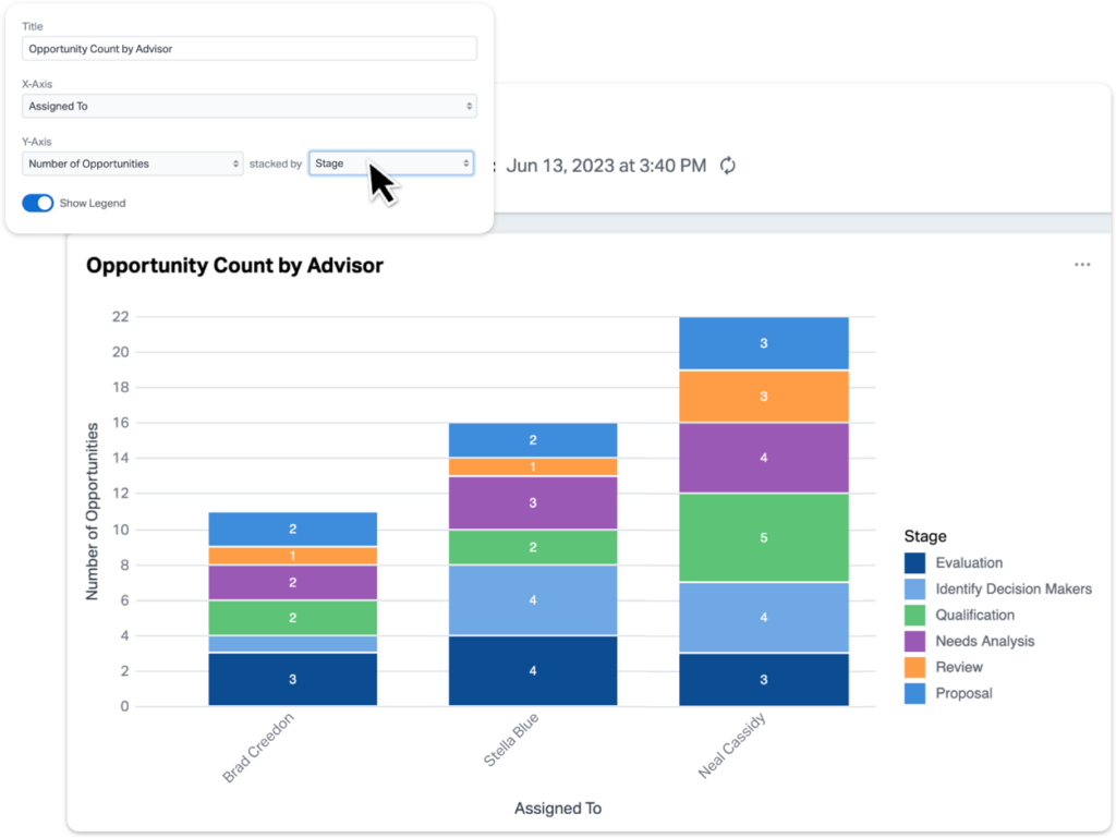
If you add a second category to a line chart, the chart will have two lines instead of one. Funnel and donut charts only support one category per report.
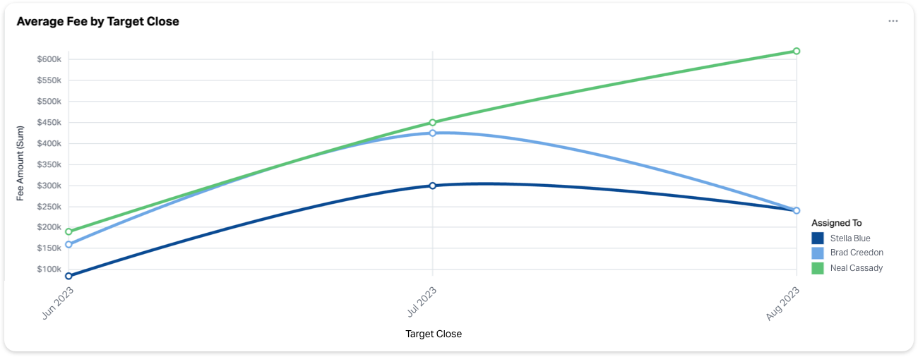
Values can be chosen for a chart based on the calculations applied to a report. For example, if you were choosing a value to chart from an opportunity report, we could select either the count of how many opportunities appear on the report or the sum of total AUM.
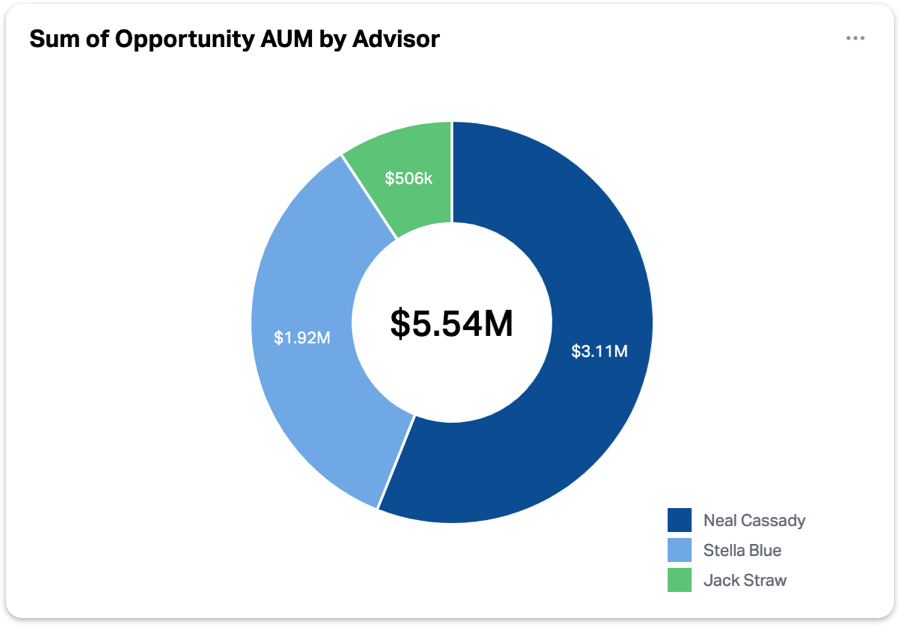
Charts and graphs are available on Premier and Enterprise plans. If you’re interested in upgrading your plan to access these visual features, talk to your Wealthbox account owner.
For more information, check out this video “How to Use Charts and Graphs in Wealthbox Reports” from our How-To video series.


