A few days ago, we got this email (below) from Greg Brown, a financial advisor and customer of Wealthbox. Greg is a savvy software user with an engineering background. As a customer he’s been very vocal – and helpful – particularly in the development of our automated workflow feature that we released several months ago in Wealthbox version 1.6. We hadn’t heard from Greg in a while until this email came in.

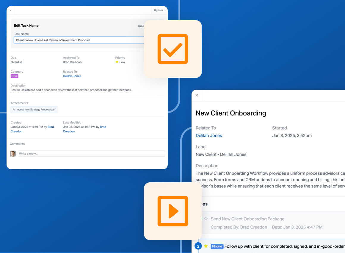
The features on the Wealthbox product roadmap are determined by a combination of our vision, previous experience in CRM ventures, and our customers’ feedback. The challenge isn’t just building all these features; it’s artfully designing these features into an elegant user experience. CRM features and user interactions need to flow and be invisible in a way. In evaluating CRM, for some there’s a mindset that’s hung up on comparing a “checklist of features” – as if these features work equally well – while ignoring the usability of these features and how they actually flow – or don’t. Usability, sleek interactions, and visual taste matter in the CRM experience.
We wrote back to Greg…

Greg replies with a sense of enlightenment (yellow highlight is ours)…

#Advisors: Find your Zen moment and get a Wealthbox free trial account in 15 seconds.
